Articles and Reports by George E.P. Box
williamghunter.net > George Box Articles > How to Get Lucky
How to Get Lucky
Copyright © 1992 by George E. P. Box. Used by permission.
Abstract
Some principles for success in quality improvement projects discuss, in particular, how to encourage die discovery of useful phenomena not initially being sought. A graphical version of the analysis of variance which can help show up the unexpected is illustrated with two examples.
Keywords: quality improvement, graphical analysis, exploratory analysis, reference distribution, serendipity
Some principles for success in quality improvement projects discuss, in particular, how to encourage she discovery of useful phenomena nor initially being sought. A graphical version of the analysis of variance which can help to show up the unexpected is illustrated with two examples.
'Tis not in mortals to command success, but we'll do more...We'll deserve it -Joseph Addison
There is a story that Napoleon once consulted some trusted colleagues concerning the advisability of appointing a particular officer to the highly responsible rank of divisional general. His advisors were in favor of the promotion and mentioned the many qualifications of the candidate. Napoleon is said to have pondered their recommendations for some time. Finally he asked, "Yes, but is he lucky?"
Now the question is a very searching one. One dictionary definition of luck is "success due to chance." In this sense anyone can be lucky once or twice but a consistently "lucky" person must, almost certainly, be doing a number of things differently and doing them right. Quality improvement like military success contains a significant element of chance, but, by and large, those who deserve to be successful are, and vice versa.
Nothing succeeds like success - Alexander Dumas
As is implied by the story about Napoleon, one way to judge the chance of future success is to look at the past record of a particular person or a particular procedure. But initially there is no past record. So this leaves open the question of how to get started. An immediate success is highly desirable; for if the first quality improvement project is a failure, the whole program may be set back. It is important therefore to choose a project that is likely to succeed and also to use techniques that maximize this possibility. One useful idea is provided by the next quote.
Where there are three or four machines, one will be substantially better or worse than the others - Ellis Ott
Ellis Ott (1975), a true pioneer in quality improvement, said that he made this remark with only moderate tongue in cheek. "He went on to make it clear that instead of machines, he might have talked about different heads on a machine, different vendors, different operators or different shifts. Once you have established that one entity is different, you can work on trying to find out what makes it so; if it is worse, then you can try to make it as good as the others; if it is better, than you can try to make all the others as good as the best. Sometimes you will find that more than one are good, or more than one are bad, but the idea is essentially the same.
An example:
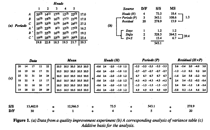
For illustration Figure 1(a) shows a set of data designed so seek out the source of unacceptably large variability which, it was suspected, might be due to small differences in five, supposedly identical, heads on a machine. To test this idea, the engineer arranged that material from each of the five heads was sampled at roughly equal intervals of time in each of six successive eight-hour periods. The order of sampling within each period was random and is indicated by the numerical superscripts in the table of data. The averages for heads are shown beneath the data table and those for periods to its right. A standard analysis of variance for this data is shown in Figure 1(b); see for example Griffith et al (1989) and BH2 (1978).
It will be seen that the appropriate F ratio (18.4/13.9 = 1.3) suggested that there were no differences in head means that could not readily be attributed to chance. The investigator thus failed to find what had been expected. However, the same analysis strongly suggested that real differences in means occurred between the six eight-hour periods of time during which the experiment was conducted. These periods corresponded almost exactly to six successive shifts which I have labeled A, B, C, A', B, C' and the big discrepancies are seen to be the high values obtained in both the night shifts C and C'.
In Figure 1(b), a further analysis of periods* into effects associated with days (D), shifts (S), and DxS confirms that the differences seem so be associated with shifts. This clue was followed up and led to the important discovery that there were substantial differences in operation during the night shift - an unexpected finding because it was believed that great care had been taken to ensure that operation did not change from shift to shift.
*The residual (HxP) can correspondingly be split into component sums of squares corresponding to HxD, HxS and HxDxS effects. Such analysis fails to show anything of further interest and is not presented here.
Rationale for the analysis of variance:
Computer programs are, of course, readily available to calculate an analysis of variance table like the one I have shown, but I'd like to remind the reader of a few underlying ideas.
Suppose, as seems reasonable in this example, possible small changes in means from period to period and from head to head are roughly additive. A data value yit coming from head i in period t can usefully be thought of as containing a contribution  from the overall average, plus a deviation
  associated with the ith head, a deviation associated with the tth period and a residual
  which is chosen se that the various components add up. Thus any rectangular table of data can be represented as the sum of four component tables in accordance with the equality
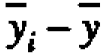
 For the present data, the first component table in Figure l(c) has all its elements equal to the grand average y=20.5. The second component table, containing the elements (-0.6,2.4, -2.0, -1.0, 1.2), shows the deviations yi - y of the five head averages from the grand average, and so on.
The sums of squares shown beneath the component tables are just the sums of the squares of the thirty individual items in each of them, and by an extension of Pythagoras's theorem it can be shown that the component sums of squares will always add up* to give the total sum of squares.
 of head averages from the grand average.
To justify the F tests, we need to assume** that the errors are distributed a) independently. b) with the same standard deviation and c) normally. On these assumptions, the residual mean square supplies an estimate of the experimental error variance o-2. If there were no real differences between heads, then the mean square for heads would also estimate o-2 and the corresponding ratio of mean squares would follow an F distribution. If, however, there were real differences the mean square for heads would be inflated.
* To save space, I have rouided these items to one decimal. Because of this rounding error, their sums of squares are not quite equal to those shown in Table 1(a).
**Alternative the test for differences in head means can be approximately justified (Fisher (1935)) on randomization theory.
You can see a lot by just looking - Yogi Berra
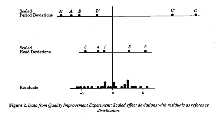
We can get a better idea of what the analysis of variance is actually doing by looking at the data graphically. Graphical analysis can also help us see things that the analysis of variance doesn't show us. There are a number of graphical techniques for looking at data of this kind. See in particular Ott (1975), Griffin et al (1989) and Tukey (1977). A somewhat different approach is shown in Figure 2. A scaled dot diagram representing the distribution of the head deviations is shown together with a dot diagram of the residuals. The latter then supplies a "reference distribution" against which the distribution for heads can be compared. The scale factor is chosen so that if there were no real differences between heads then the head dot diagram would have the same theoretical variance as that for the residuals. The appropriate effect scale factor is then given by the formula

Thus the scale factor for heads is 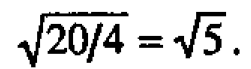 We see that the head deviations and residuals look as if they might readily have come from the same distribution. On the same basis the scale factor for periods is
 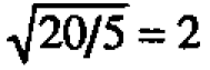 and period deviations appear highly discrepant. Also bear in mind that the residual reference distribution can be thought of as "slideable" with respect to the others distributions. From which you can see, in particular, that there is no reason to suspect that the means from shifts A, B, A' and B are different.
Original data should be presented in a way that will preserve the evidence in the original data - Walter Shewhart
Notice that the graphical analysis is valuable because it is capable of showing things that might be missed in the more formal analysis of variance table. It can show, for example, whether the plotted residuals look as though they came from a single stable error distribution. If there were outliers this might suggest that, even when possible differences due to shifts and heads were allowed for, the process might be unstable (or perhaps that one or more numbers had been wrongly recorded, for example, 42 might have been written for 24).
Separate dot diagrams for residuals from each of the six periods and from each of the individual heads may also be plotted. For example, although no differences were found in the heads averages, individual plots might suggest that products front one of the heads were more variable than the others. Also, because the heads were sampled in random order, plotting the residuals in time order could warn us of drifts taking place during a shift. The reader, if s/he wishes, may make these additional analyses and see if s/he can find anything else of interest in this data. Remember, however, that from this kind of data "mining"; you should look for clues not final conclusions. If you find suspicious patterns that you think might be important, you should check these out in later experimentation.
Serendipity:
Perhaps what Napoleon was looking for was not so much luck, as serendipity. This quality, named by Horace Walpole, comes from the fairy tale of The Three Princes of Serendip who "were always making discoveries, by accidents and sagacity, of things they were not in quest of."
Notice how the engineer deliberately created opportunities for serendipity to take place. Although the stated objective of the study was to look for possible differences in means from different heads, he set up the experiment so that he would be able to check for other things such as possible differences associated with shifts and days. Also, by randomizing within shifts, he could look for possible dependence on time order. Finally, by using appropriate exploratory graphical analysis (Tukey (1977)), he was able to check on questions not accessible by formal analysis.
Computer programs:
In practice statistical analysis is usually done with computer programs. It is important, however, that you and not the computer are in charge of deciding what to look for. (To ensure this, you may have to write you own program. In particular, an appropriate variety of graphical aides should be programmed for display and study.)
A post script:
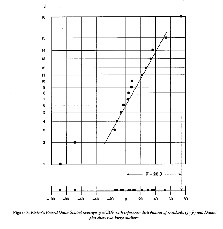
As a final illustration of Shewhart's and Berra's points, let's consider some data used by Fishes to illustrate the paired t test in his classic book The Design of Experiments (Fisher (1935)). The object was to determine whether inbred (A) and cross bred (B) plants had different rates of growth. After a suitable growth period, the difference in height between an A plant and a B plant grown in die same pot was measured in units of eighths of an inch. The data (yi), which consisted of fifteen such differences farm fifteen pots, had an average of =20.9. A paired t test based on the normal model shows that this difference is just significant at the 5% point. In the corresponding graphical analysis we could scale the average difference with a factor of 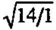 and relate this to a reference distribution of the residuals
 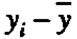 .
.
This is done in Figure 3 which shows that three points appear discrepant with the main body of the residual distribution-the scaled average and two outlying observations. This conclusion is underlined by plotting the points on normal probability paper, see for example Box, Hunter and Hunter (1978) and Bisgaard (l988). The existence of these outliers and speculation as to their origin has been noted by other authors but shows up particularly well in this plot.
Remember, finally, that your engineers and your competitor's engineers have had similar training and mostly believe the same kind of things. Therefore, finding out things that are not expected is doubly important because it can put you ahead of the competition.
Ackowledment
I am grateful for the help received from Bruce Ankenman in preparing this column.References
Bisgaard, S. A Practical Aid for Experimenters.
Starlight Press; Madison, WI,1988.
*Box, G.E.P., W.G. Hunter and J.S. Hunter. Statistics for Experimenters. John Wiley; New York, 1978.
Fisher. R.A. The Design of Experiments. Oliver and
Boyd; Edinburgh and London, 1935.
Griffin, B.A., A.E.R. Westman and B.H. Lloyd.
"Analysis of Variance." Quality Engineering.
2(2). 1989-90, p. 195.226.
Ott, Ellis R. Process Quality Control. McGraw-Hill;
New York. 1975.
Tukey, J.W. Exploratory Data Analysis. Addison
Wesley; Reading, Mass., 1977.